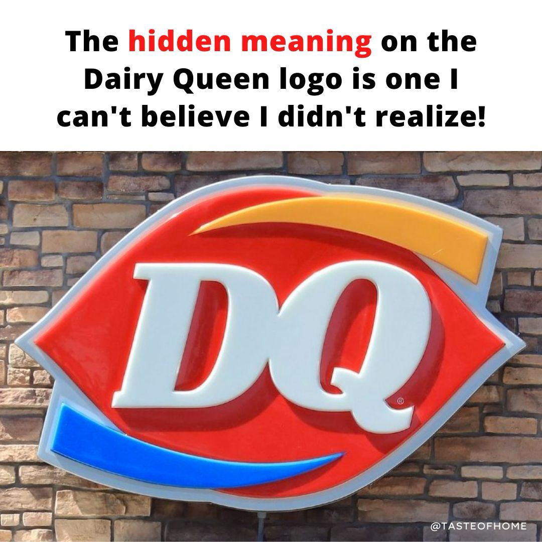
more than 40 years before the text was simplified in 2001.
The 2001 logo swap followed after many customers began shortening the restaurant’s name to DQ. It dropped the spelling of the full name and simply featured ‘DQ’ in large bold white letters.
In 2007, DQ enhanced the Dairy Queen logo with a few simple tweaks. The letters were italicized and arched continue reading …